Creating a warm welcome to T.O.M.S
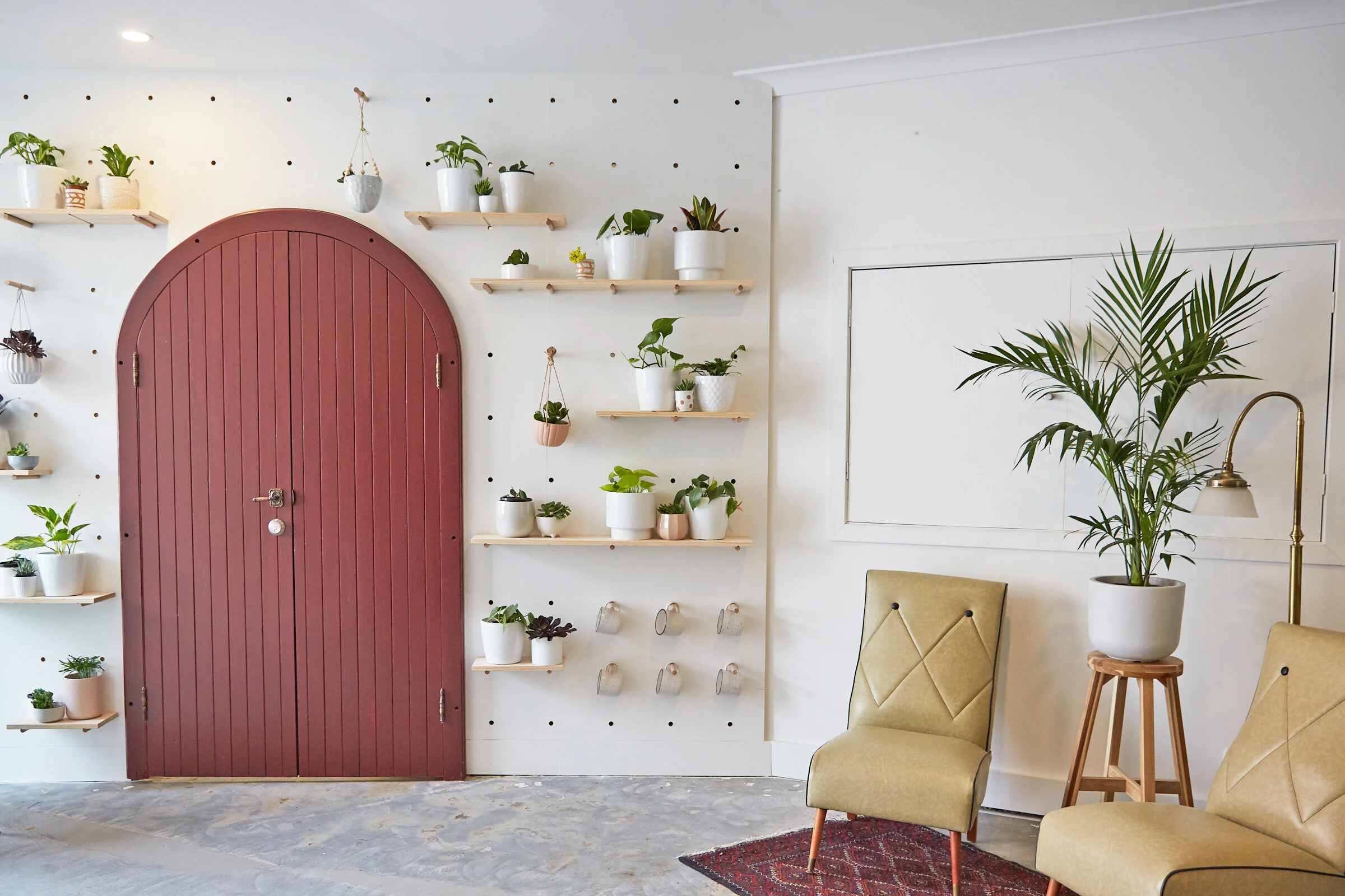
First impressions count. So we wanted T.O.M.S entrance to represent not only the entire building’s styling and qualities, but we want you to get a sense of the warm welcoming feeling you’ll discover when you explore the space. The first thing you see when you peak inside T.O.M.S Place is the plant-filled peg board, featuring a door we found in the building and painted to match a heritage maroon we found throughout the building.
Our first move was to strip the floors to expose the concrete and paint the walls a warmer white. We divided the entrance into two distinct spaces, the entrance to T.O.M.S Place on the right and a separate leasable space in front. We designed this custom front desk to create a statement at the entrance with the colour matching the building’s heritage trusses.
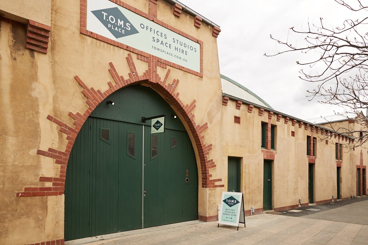
Before it was T.O.M.S Place, 1 Tripovich Street has been a market place, skating rink, a book store, a dance studio, a box factory, a storage for an underwear brand, as well as a base for the Red Cross. The ‘Our Story’ wall is a little nod to this history. All the installation details were custom-made, including the bespoke tenant ‘Scrabble’ style tiles.
Like throughout the building, the entrance is full of second hand and vintage gems, including the 1970’s primary school weather and calendar chart.


